Grafana integration example
This example shows how to integrate Exorde API with Grafana. Our goal is to create a dashboard to track the sentiment of Bitcoin and Ethereum.
You can download the dashboard here and import it to quickly get started. Or you can follow the tutorial below to create the dashboard from scratch. All calls made to the Exorde API are explained.
As we create the dashboard step by step, we kept is as simple as possible. A more advanced dashboard is available on our GitHub. You can follow the instructions in the README to import it.
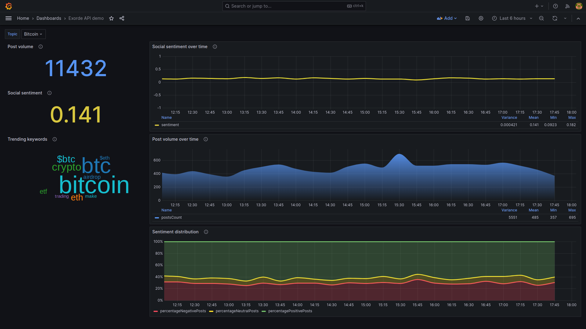
The dashboard will look like this:
Access the Exorde API
First, to use the Exorde API, you need to create an account on Exorde developers portal. You'll get 1000 free credits and an API generated on your first login. Keep it safe, you'll need it to authenticate your requests.
Run Grafana locally
If you don't have a Grafana instance, you can run one locally using a docker container, listening on port 3000:
docker run -d -p 3000:3000 \
  --env GF_INSTALL_PLUGINS=magnesium-wordcloud-panel,marcusolsson-json-datasource \
  grafana/grafana
Grafana is available at http://localhost:3000. The default username and password are both admin.
If you already have a Grafana instance, ensure that the Word cloud and JSON API plugins are installed.
Connect Grafana to the Exorde API
Add a JSON API connector, to enable Grafana to query the Exorde API:
Go to
Main menu>Connections>Data sources.Click on
Add data source.Type
JSON APIin the search bar.Click on
JSON APIdata source.Fill the form:
- Name:
Exorde API - URL:
https://api.exorde.io - Authentication:
No Authentication - HTTP Headers: add the following headers:
Accept:application/jsonX-Exorde-Api-Version:v1Authorization:Bearer <YOUR_API_KEY>
- Name:
Click on Save & Test to validate the connection.
Import the dashboard
If you want to create the dashboard from scratch, you can skip this step and go to the next section.
To import the dashboard:
- Copy the content of the dashboard from here.
- Go to
Main menu>Dashboards>New>Import. - Paste the content of the dashboard in the
Import via dashboard JSON modelfield. - Click on
Load. - Select the
Exorde APIdata source. - Click on
Import.
Create a dashboard
Create a new dashboard to explore the Exorde API:
- Go to
Main menu>Dashboards>New>New dashboard. - Go to
Dashboards settings(gear icon). - Rename the dashboard to
Exorde API demo. - Set the
Graph tooltiptoShared Tooltip.
The dashboard is configured, now we can add some visualizations to track the sentiment of Bitcoin and Ethereum:
- total volume of posts
- average sentiment
- sentiment over time
- volume of posts over time
- proportion of positive, negative and neutral posts
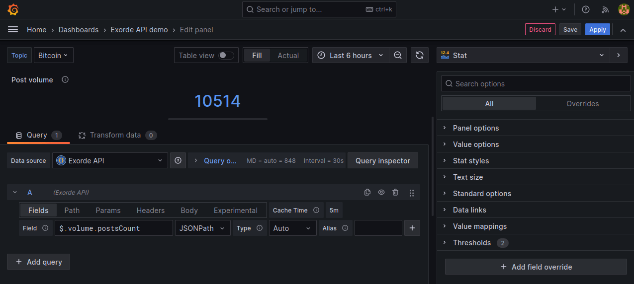
Total volume of posts
The goal of this visualization is to display the total volume of posts collected for the selected keyword(s), in a big number. We'll use the Get volume endpoint to get the total volume of posts between the selected dates.
Click on
Add>Visualization.Select the data source
Exorde API.Select the
Statvisualization.Configure the query on
Querytab:- On the
Pathtab, set the path to/volume. - On the
Paramstab, set the following parameters:keywords:btc,bitcoin,$btcstartDate:${__from:date:iso}endDate:${__to:date:iso}
- On the
On the
Fieldstab, set the following fields:$.volume.postsCount(type:Number)
Configure the panel:
- Panel options:
- Title:
Post volume - Description:
The volume of posts collected. - Transparent background:
true
- Title:
- Standard options:
- Color scheme:
Single color(blue)
- Color scheme:
Click on Apply to apply the changes.
Here is a summary of the configuration:
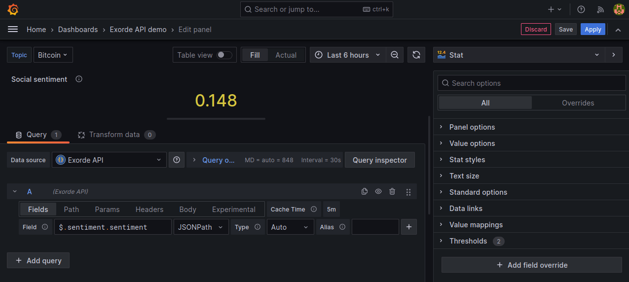
Average sentiment
The goal of this visualization is to display the average sentiment of posts collected for the selected keyword(s), in a big number. We'll use the Get sentiment endpoint to get the average sentiment of posts between the selected dates.
Click on
Add>Visualization.Select the
Statvisualization.Configure the query on
Querytab:- On the
Pathtab, set the path to/sentiment. - On the
Paramstab, set the following parameters:keywords:btc,bitcoin,$btcstartDate:${__from:date:iso}endDate:${__to:date:iso}
- On the
On the
Fieldstab, set the following fields:$.sentiment.sentiment(type:Number)
Configure the panel:
- Panel options:
- Title:
Social sentiment - Description:
From -1 (negative) to 1 (positive). - Transparent background:
true
- Title:
- Standard options:
- Min:
-1 - Max:
1 - Color scheme:
Red-Yellow-Green (by value)
- Min:
Click on Apply to apply the changes.
Here a summary of the configuration:
Sentiment over time
The goal of this visualization is to display the sentiment of posts collected for the selected keyword(s) over time. We'll use the Get sentiment history endpoint to get the sentiment of posts collected for the selected keyword(s) over time between the selected dates. We'll use the Time series visualization to display the sentiment over time. We limit the number of data points to 1000 (the maximum allowed by the API) and the interval to 15 minutes. So the chart will contain up to 1000 data points, one every 15 minutes.
Click on
Add>Visualization.Select the
Time seriesvisualization.Configure the query on
Querytab:- On the
Pathtab, set the path to/sentiment/history. - On the
Paramstab, set the following parameters:keywords:btc,bitcoin,$btcstartDate:${__from:date:iso}endDate:${__to:date:iso}limit:1000interval:15
- On the
On the
Fieldstab, set the following fields:$.items[*].startDate(type:Time)$.items[*].sentiment(type:Number)
Configure the panel:
- Panel options:
- Title:
Social sentiment over time - Description:
The sentiment (from -1 most negative to 1 most positive) and the volume of posts collected.
- Title:
- Legend:
- Mode:
Table - Values:
Variance,Mean,Min,Max
- Mode:
- Graph style:
- Style:
Lines - Line interpolation:
Smooth - Line width:
3 - Gradient mode:
Scheme - Point size:
1
- Style:
- Standard options:
- Min:
-1 - Max:
1 - Color scheme:
Red-Yellow-Green (by value)
- Min:
Click on Apply to apply the changes.
Here is a summary of the configuration:
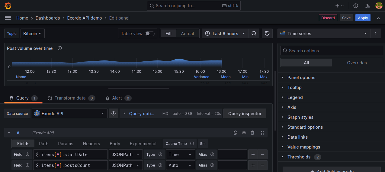
Volume of posts over time
The goal of this visualization is to display the volume of posts collected for the selected keyword(s) over time. We'll use the Get volume history endpoint to get the volume of posts collected for the selected keyword(s) over time between the selected dates. We'll use the Time series visualization to display the volume over time. We limit the number of data points to 1000 (the maximum allowed by the API) and the interval to 15 minutes. So the chart will contain up to 1000 data points, one every 15 minutes.
Click on
Add>Visualization.Select the
Time seriesvisualization.Configure the query on
Querytab:- On the
Pathtab, set the path to/volume/history. - On the
Paramstab, set the following parameters:keywords:btc,bitcoin,$btcstartDate:${__from:date:iso}endDate:${__to:date:iso}limit:1000interval:15
- On the
On the
Fieldstab, set the following fields:$.items[*].startDate(type:Time)$.items[*].postsCount(type:Number)
Configure the panel:
- Panel options:
- Title:
Post volume over time - Description:
The volume of posts collected.
- Title:
- Legend:
- Mode:
Table - Values:
Variance,Mean,Min,Max
- Mode:
- Graph style:
- Style:
Lines - Line interpolation:
Smooth - Line width:
0 - Fill opacity:
100 - Gradient mode:
Opacity - Point size:
1
- Style:
- Standard options:
- Min:
0 - Color scheme:
Single color(blue)
- Min:
Click on Apply to apply the changes.
Here is a summary of the configuration:
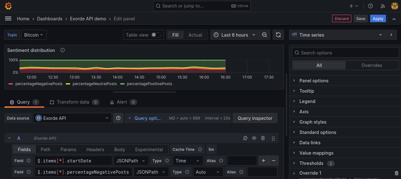
Proportion of positive, negative and neutral posts
The goal of this visualization is to display the proportion of positive, negative and neutral posts collected for the selected keyword(s) over time. We'll use the Get sentiment history endpoint to get the distribution of posts' sentiment for the selected keyword(s) over time between the selected dates. We'll use the Time series visualization to display the sentiment distribution over time, staking 3 series. We limit the number of data points to 1000 (the maximum allowed by the API) and the interval to 15 minutes. So the chart will contain up to 1000 data points, one every 15 minutes.
Click on
Add>Visualization.Select the
Time seriesvisualization.Configure the query on
Querytab:- On the
Pathtab, set the path to/sentiment/history. - On the
Paramstab, set the following parameters:keywords:btc,bitcoin,$btcstartDate:${__from:date:iso}endDate:${__to:date:iso}limit:1000interval:15
- On the
On the
Fieldstab, set the following fields:$.items[*].startDate(type:Time)$.items[*].percentageNegativePosts(type:Number)$.items[*].percentageNeutralPosts(type:Number)$.items[*].percentagePositivePosts(type:Number)
Configure the panel:
- Panel options:
- Title:
Sentiment distribution - Description:
The distribution of positive, negative and neutral posts.
- Title:
- Tooltip:
- Tooltip Mode:
All
- Tooltip Mode:
- Graph style:
- Style:
Lines - Line interpolation:
Smooth - Line width:
3 - Fill opacity:
25 - Gradient mode:
None - Point size:
1 - Stack series:
100%
- Style:
- Override 1:
- Fields with name:
Percentage of negative posts - Standard options > Color scheme:
Single color(red)
- Fields with name:
- Override 2:
- Fields with name:
Percentage of neutral posts - Standard options > Color scheme:
Single color(yellow)
- Fields with name:
- Override 3:
- Fields with name:
Percentage of positive posts - Standard options > Color scheme:
Single color(green)
- Fields with name:
Click on Apply to apply the changes.
Here is a summary of the configuration:
Rearrange the panels
Now that we have added all the visualizations, we can rearrange the panels to make the dashboard more readable, like this:
